Building usable conversations: Conversational information architecture
January 28, 2019I wrote a book about voice content and how to build content-driven voice interfaces. Voice Content and Usability is A Book Apart’s first-ever voice design book. You can learn more about what’s in the book or sign up for preorders.
This is part of a series of articles on conversational content strategy, with installments about conversational interfaces, design, content strategy, usability testing, and Ask GeorgiaGov, the first voice interface for residents of the state of Georgia. Reprinted from the Acquia Developer Center with permission from DC Denison (Senior Editor, Acquia).
In this second installment in our series on conversational usability, we dive into a relatively overlooked area of conversational interfaces that can have an outsized impact on the eventual user experience that results: information architecture. How information is organized, and how that scheme is presented to the user, make up a fundamental part of building usable and navigable websites. But what happens when we apply those same principles to conversational interfaces?
Information architecture is a key element of your conversational interface, but all of the calculations we're accustomed to from information architecture in other worlds change entirely. In this post, we'll discuss how to leverage an optimal information architecture for your conversational interface and answer these questions: What is the equivalent of a hub-and-spoke architecture in conversational interfaces? How can we help users more easily navigate conversational interfaces without any visual or physical component?
Multichannel information architecture
In their book Information Architecture for the Web and Beyond, Louis Rosenfeld, Peter Morville, and Jorge Arango write that information architecture "asks designers to define semantic structures that can be instantiated in multiple ways depending on the needs of different channels. A navigation structure that works well in a desktop web page should function differently when presented on a five-inch touchscreen, but the user's experience with both should be coherent" (page 18).
Information architecture on the web and on conversational interfaces should operate precisely the same way: provide the user with a means to navigate and understand both experiences but with a sense of cohesion across these channels. Frequently, we encounter cases where there is a mismatch between the expectations met by navigational structures on a boutique shop's website and expectations met by navigational structures in the brick-and-mortar equivalent.
Over the past several decades, with the advent of the World Wide Web, our notions of information architecture in artificial interfaces like smartphones and desktop computers have largely remained the same. But when it comes to the more natural progression of a conversation, with its stops and starts, its hesitations and mistakes, and its backtracks and sidetracks, our traditional notions of information architecture serve us less well.
Information architecture on the web

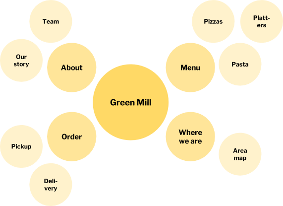
Information architecture on the web is characterized by a single type of hierarchical structure that can manifest itself in a variety of ways: the hub-and-spoke pattern. Every website with a hierarchical structure in its content generally looks like the above. When it comes to information architecture on the web, the perennial challenge has been how to recast the hub-and-spoke architecture in ways that would not trip up users.
One of the most enduring manifestations of information architecture on the web is the humble sitemap, alternately derided and boosted across generations of web designers. Sitemaps are the most straightforward and understandable illustration of the hub-and-spoke structure for new users to a website, but they also suffer from information overload. Sometimes, offering the user the most comprehensive view of the information across a website is suboptimal, as we will shortly see in the conversational context.
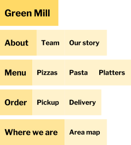
Meanwhile, ubiquitous across the web today is the navigation bar or navbar, with its drop-down variants, that expresses, with a high degree of efficiency, the hub-and-spoke architecture to which web content typically hews. Nonetheless, navbars by their very nature need to exclude superfluous information that is less immediately relevant to the user. Additional complications include common requirements such as an active trail and breadcrumbs to assist the user when the navbar becomes more unwieldy.

This brings us to some of the most salient differences between web-optimized and conversation-optimized examples of information architecture. Whereas it is possible in web-optimized approaches like sitemaps and navbars to immediately introspect and see the entire site's structure, this isn't the case in a conversational context.
In a typical conversation, we have to be given the structure that mirrors a usable information architecture, irrespective of whether we're using a voice assistant or a chatbot. The decontextualized nature of conversations, taking place without a surrounding familiar visual or physical setting, means that parameters that dictate how information can be accessed either need to be presented at the start of a conversation by the interface or incrementally revealed over the course of a user's interactions. Both approaches introduce complications that we inspect in the next section.
Information architecture in conversational interfaces

What exactly does it mean for the structure of a conversational interface to be given to us? Information architecture in conversational interfaces requires an approach of progressive disclosure about the interface's components to avoid information overload or decision fatigue. By progressive disclosure, I mean the slow reveal of information, starting with the key functions necessary to start and stop an interaction and ending with a full understanding of the various modes by which we can interact with conversational interfaces.
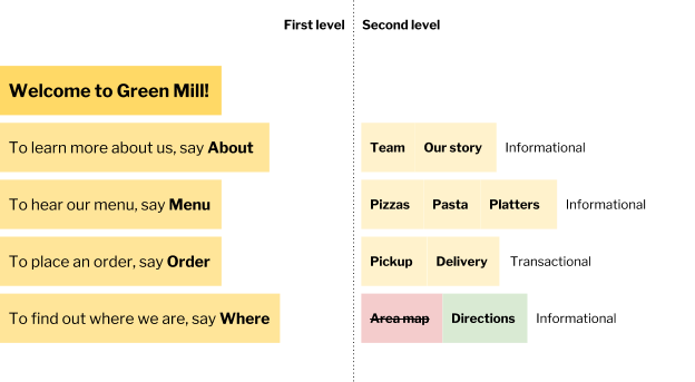
We can compare the experience of information overload on a conversational interface to a sitemap on a website; comprehensive but woefully unusable. Meanwhile, a set of short navigational instructions in the case of a voice assistant (e.g. "To exit, just say Exit") or an initial guiding message in the case of a chatbot (e.g. "Text Go to continue") can disclose just the right amount of information and express just the right amount of structure, much like a navbar on the web.
When we consider these limitations on conversational interfaces, which can be far more restrictive than those on the web due to the lack of a physical or visual component in the interface, we can recognize that information architecture in a conversational context requires a guided, unidirectional flow as opposed to a sitemap or even a navbar. Even the example depicted in the figure above illustrates a recasting of the typical functions in a navbar to those of utterances in a voice-driven interface.
IA strategies for chatbots and textbots
In this section, we delve into some of the most compelling strategies that we can undertake as designers and developers of conversational interfaces. For chatbots, textbots, and other text-based messaging interfaces, many of the calculations surrounding organization and navigation of interface components become easier owing to the availability of a visual and physical component within the interface.
Many chatbots and textbots offer an introductory message with a few options to help the user get started with the desired task. Much like voice assistants, many of the mechanisms by which users navigate across chatbots and textbots reflect a physical approximation of the space being navigated. For instance, a user might write "Back" to go back to a previous interface state, or they might write "Up" to travel up one level in the hierarchy.
At the same time, orientation becomes much easier in a chatbot or textbot context, due to the high verbosity tolerance of text. A single text message can carry information not only about where the user is in the hierarchical structure of the interface but also instructions about how to travel back and forth across components in the interface. This is not possible in a voice assistant, as the user's ability to refer back to previous text earlier in a message is compromised without an expansive short-term memory.
As such, my recommendation for chatbot and textbot developers has always been to make as much use of the available space as possible, even if you are exposing nontraditional interfaces to the user such as conversational forms (HTML or HTML-like forms interpolated into a chatbot conversation). A simple orientation sentence at the start of each chatbot message can help the user have the same experience that they would upon seeing a breadcrumb trail on a web page. Similarly, ending a message with navigation options can approximate the experience of using a browser or referring to the navbar.
IA strategies for voice assistants
For voice assistants, information architecture is a problem seemingly fraught with nothing but pitfalls. Often, the most bewildering aspect of voice assistants is the fact that there is a limited attention span that each user is able to wield in order to retain information about how to navigate or access certain sections of a conversational interface. As a result, expressing information about where a user is or where they can go is much more difficult.
Many voice assistants try as hard as possible to mirror the experience of a real conversation by ending their utterances with questions that exhort the user to respond or a directive to say a command to proceed. These are effective means of helping the user navigate, but they may not be as effective when it comes to orientation. After all, in natural conversation, it is a well-understood notion that a response moves the conversation into a different state, whether that means improved mutual understanding, transmission of information, or a completed transaction.
Orientation is often much more difficult in a voice assistant setting, because the user typically has experienced a chain of interlocutions with the interface rather than a conversation that orients them at each turn like a chatbot might. As a result, orientation must take place in subtler ways in voice assistant interfaces, whether by offering a "You are here" wayfinding statement that helps the user understand where they are in the organizational scheme of the interface or by explaining key navigational actions at the start of the interaction (e.g. "To order, say Order. To go back, say Back.").
When it comes to voice assistants like Amazon Alexa and Google Home, often the best approach is to follow the stipulations and guidelines that the respective ecosystems set out for designers and developers. For instance, Amazon Alexa comes built-in with the ability to say "Exit" at any point within a skill to travel up one level in the hierarchy away from a custom interface and back into the root Alexa interface. However you conceive of navigation and orientation in voice assistants, it is important in a voice-driven environment to give the user enough at the start of the interaction to proceed and to orient the user to some degree at each point in the conversation in the hierarchical system you have architected.
Conclusion
As we've seen from this investigation of information architecture in conversational interfaces, the organization of the components of your interface, whether they manifest themselves in an informational or transactional conversation, is exceedingly important to guaranteeing the success of your user. And as the channel explosion continues, it is becoming increasingly difficult to present to users a scheme that makes sense across multiple channels.
Our takeaway from our exploration of conversational information architecture should be to shed our preconceived notions of information architecture brought from the web and to recalibrate the hub-and-spoke structure that reflects most web experiences into a more guided, unidirectional flow that allows users not only to access all components of the interface but also to understand where they are and what they can do each step of the way.
In the next installment of this series on building usable conversational interfaces, we direct our attention to design and some of the principles that, coupled with our new understanding of information architecture, can lead to a conversational user experience that can match the high standards we expect of websites today. Next station stop: conversational design.